Friday, June 30, 2017

Difference between IF and IIF?

Hello All,

This blog is related to most common question, what is the difference between IF and IIF? Read the below comments and you will have the exact information about this.


1) IF can't return Boolean whereas IIF can return Boolean also.

               IF 1=1 THEN TRUE ELSE FALSE END // This will give you error, cannot use Boolean type with IF expression.

IIF(1=1,TRUE,FALSE) // This will execute perfect.

2) IF is like a statement in syntax (IF test THEN '' ELSE '' END) where as IIF is like a function
 IIF(test,then,else,[unkown])

3) IF takes 3 values whereas IIF takes 4 parameters.

4) ELSEIF can be use with IF but there is no way to use ELSEIF with IIF.


Tableau Desktop References:

IF <expr> THEN <then> [ELSEIF <expr2> THEN <then2>...]
[ELSE <else>] END

Tests a series of expressions returning the <then> value for the first true <expr>.

Example: IF [Profit]>0 THEN 'Profitable' ELSEIF [Profit] = 0 THEN 'Breakeven' ELSE 'Loss' END


IIF(test, then, else, [unknown])

Checks whether a condition is met and returns one value if TRUE, another value if FALSE, and an optional third value or NULL if unknown.

Example: IIF([Profit]>0,'Profit','Loss').

If you have any question, please comment below.

Thursday, June 29, 2017

Introduction - 2

Hello Friend,

Continued to my previous blog, here we are going to know more about some sub menu and create our first dashboard. I am going to tell you about most important menu i.e. Analysis & Server.  But, first let's start with our first dashboard.

1) Open workbook by clicking on tableau launcher.


2) Select Sample - Superstore from Saved Data Source below of below bar.


3) Drag all the fields use in snapshot into the view.


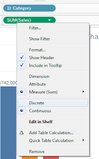
Note: There are some of are blue and some of are in green color. The blue color shows that it's a dimension and green color shows it's a measure. In some situation, if any of measure you want to as dimension, you just need to change it as discrete.

3) To show sum of sales on each bar, you just need to drag Sales measure over Label in Mark shelf. I have used the T icon on Tool Bar. This is the other way to get this done.

We can change this bar chart in any other view also, Like in my case, i have created two more duplicate sheet and changed the chart type as Pie and Bubble Chart from Show Me tab.

You will have a minimum requirement of  type of data shown below all the charts.


I have create one more sheet for line chart. I can't have this by just copy the Bar Chart. Because, minimum required data is one Date (Continuous) and one measure and date we don't have with bar chart.


Now, go to dashboard menu and click on new dashboard. You will have all the created sheet list on your left side sheets shelf. Just drag all the sheet over the dashboard.

Next Step is to have filters on dashboard. Go to Analysis then sub menu Filters and just click on filter which you want. The number of filters are same as you have opted on sheet. If you want more and drag and drop in to filter shelf.

After all this you will have the dashboard like below. Just you need to work on formats. This will be in my next blog. How to format the dashboard?


Analysis - Indeed all menus are important, but Totals is use most frequently. Using this sub menu, we will have all type of total. Total by columns, total by rows and sub totals.

Rest menus, you can use into your scenarios and comment below if you have any query. Like for filters, Marks etc.


Server - When we finish our workings and the workbook is ready to go live for user, We will publish the workbook on tableau server by clicking on Publish Workbook...


Enter server name and hit Connect.


Enter username and password.

Select Project name, enter workbook name, select the sheets which ever you want to publish on server and hit publish and you will have you dashboard on your server.


You can have the workbook by clicking on the link. Sample - Superstore

I hope this was exciting for you. We will be back with some other interesting blog. If you have any query, please comment below.

How to use parameter with filter?

Scenario

I am using Superstore data. I have a dimension named Product Name. I want to filter out the data which contains some of given string by user.


To achieve this, We need to play with Parameter and Calculated field. Now, why we are using these things.

Parameter - When ever there is any need to get input from user, we need to use Parameter. You can create parameter by two ways:

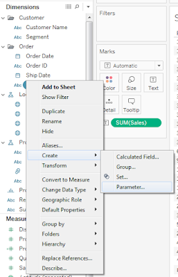
1)  Right click on any dimension and select Create -  Parameter....

2) Click drop down arrow on right side of Dimension shelf header.


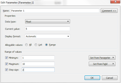
Using any of those two method you will have parameter. Now will have a window with some of option to create it.

Name: Any name you can put here as per your requirement.

Data Type: The data property, Float, String, Date, Boolean, etc. Option below depends on the data type selected.


Current Value: First selected value.

Display Format: This will format the displayed data.


Allowable values: 
  • All - Selecting this, user can any input depends on data type selected. User will get a text box to type in.


  • List - Using list, you will have a list of the data as drop down. You need to enter Value and Display As. You can have different text in both the options. But, keep in mind that, you will play on Value for any calculation.
    •  You can manually enter the values or paste from other source using "Paste from Clipboard".
    •  If you want to have the actual values coming into a dimension, then you can use "Add from field".


  • Range - Range will give you a slider to choose any value from data. 
    •  Minimum: If you want to have a minimum value for this parameter, you can put that value in this field.
    •  Maximum: If you want to have a max value for this parameter, you can put that value in this field.
    •  Step Size: This field indicate the different between on every slide. Like, your current value is 5 and step size is 2. Then, when you slide up the parameter this will add 2 to current value and on slide down it will show 3 on each slide.


Calculated Fields - Calculated fields are like a result of any formula using different kind of statements and functions. Like parameter, you can create this also by two same ways. Just need to click on Create Calculated Field... option.


Now let's start with the actual scenario. How we will use both parameter and calculated fields.

Below are the steps to get this done,

1) As we want to filter out Product Name ans it's data type is  String. So we need to create a parameter as data type string.


After creating this, it will show under Parameter shelf. Just just need to right click and select show parameter.


2) Now, we need to create a calculated field as below. I have created two  types of parameter, which returns Boolean and String with two different formulas. You can achieve this task by both ways.


If you are going with Boolean, you just need to put this in filter shelf selected as True.

If you are using String, then you just need to use this in Row shelf.

You will have the below view after going all this.


You can have the workbook by clicking on the link. Workbook - How to use parameter with filter?

If you have any question, please comment below.

Wednesday, June 28, 2017

Introduction - 1

Hello All,

Welcome to my blog and hope you are doing well. In this blog, i will share all the real-time scenarios coming in any group of organisation.

But, before go into deep dive in those scenarios, i would like to first tell you about the basic component or element of tableau desktop. Why i want to tell this, because in my starting day, i was in some situation where i didn't know what to do and that it available in tableau just one click away.

So, lets start with that.

Tableau is BI (Business Intelligence) tool, provides data analytics into interactive form like Bar, Line, Pie charts and many other forms by connecting different sources of data.


1) Menu - This is the common menu, you will get in all the windows software.

2) Tool Bar - This bar is just below the Menu. Its just the icon form of sum of sub-menu.

3) Data/Analytics - Below of Tool Bar, on left side these tabs are there.

4) Dimensions - This shelf indicating all the level of data in the form of String, Boolean, Date, etc.

5) Measures - This shelf shows the facts of the data in the form of numeric.

6) Pages - This will have the information of pages included in Story.

7) Marks - This shelf shows all the options which needs to be view on charts.

8) Color - Using this we visualize the data into different colors on the basis of measures or
dimension.

9) Size - This will increase or decrease the size of charts.

10) Text - Text will show any of the information included on view as text on the same view.

11) Detail - This option this used to show some extra information of data.

12) Tooltip - Any information need to be show as popup, we can use tooltip.

13) Columns - Any data, if we want to see as in column.

14) Rows - Any data, if we want to see as in row.

15) Show Me - This option is on the right side of Tool Bar. Having the options to choose different type of charts.

16) Sheet - We will use this option sheet/worksheet for creating any type of visualization.

17) Dashboard - We will include all the sheets into one dashboard/workbook

18) Data Source - This option use to connect different sources of data.

19) Story - We can use this option, in case of story board visualization.

Now when you go to dashboard tab, we will have some more shelves

1) Device Preview - Since tableau 10, they are supporting for mobile also. So, we can see the preview of workbook as mobile/tab view.

2) Sheets - This shelf shows list of available sheets in workbook.

3) Objects -  All the available controls like container, images, text etc are available in this.

4) Tiled - This option is use to where we want to align the worksheets in order.

5) Floating - Floating option use in case we want to overlap any view.

6) Show dashboard title - By checking this, we will have a title for the dashboard.

In next post, we will learn about the more about the sub menus and Sample - superstore data and try to visualize some basic charts.

For any doubt and question, please comment below.